How effectively are you using PowerPoint?
By Miguel Talag and Ethan Mansur
In this article, we encourage you to take a step back and reflect on how, when and why you use PowerPoint, a program that is now ubiquitous — though often undervalued — in second language classrooms around the world. Our goal is to remind our fellow teachers of why we use this program in the first place. This reflection is organized around five important questions we think all teachers should ask themselves. Along the way, we’ll also give both general advice and concrete tips for using PowerPoint in a more purposeful and engaging way.
1) Does your presentation capture students’ attention?
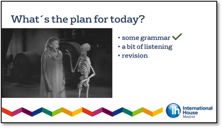
PowerPoint can be so much more than a high-tech way of projecting text and images. The first slide, for example, is like a first impression. It sets the tone. If it’s drab and uninteresting, your class doesn’t bode well. But if it’s compelling and interesting, it will spark interest. In our experience, a good first slide can even begin a conversation all by itself.

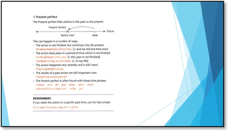
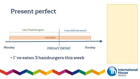
The first slide above tells students nothing they don’t already know. The second slide is definitely more pleasant to look at, but it doesn’t introduce the theme of the lesson. The third one, however, sets the scene and sparks conversation. It’s also branded, so it looks more professional.
There are a lot of features in the program that help you generate interest, but sometimes a simple, well-chosen photo is the best option. Ask yourself, do I smile when I look at the photo? Or even better, do I laugh?
In terms of graphics, backgrounds, animations, and so forth, PowerPoint is a vast, uncharted territory to be explored. Take the time to meander through the program. Randomly try things. Acquaint yourself with the features in each tab, especially the “insert” and “animations” tabs. Fraternize with themes. Don’t overdo it, but consider using word art, Smartart and shapes. These are ways of generating and maintaining interest throughout a lesson.
Useful tip: Another slightly more advanced, but very effective tool is GIFs. For the unacquainted, a GIF is a series of frames that play in a loop, like a high-tech flip book. GIFs can get a lesson started with a smile, indicate you’re moving onto a different stage or topic, or simply get students attention during a part of the lesson that might otherwise get a bit heavy. To find GIFs, simply do a Google image search with “GIF” added to the end. Once you find one you like, simply save it as a GIF (not a JPEG) and then insert into your presentation like any other image.
2) Does your presentation create flow and structure?
PowerPoint is a map, not just a collage of images and text. For many teachers, PowerPoint is effectively a high-tech overhead projector. It can be so much more. If used effectively, it can be a guide that keeps you from losing your place, even replacing the traditional lesson plan you jot down in your notebook.
At the start of the lesson, tell the students what they can expect that day by putting up a list of what you will (ideally) cover in the lesson.

This will chart the journey of your lesson; the students will be able to see the different stages clearly, like they do when they punch a destination into Google Maps. As the students move through the lesson, add slides that signpost the progress you’re making, reminding them where they’ve been and where they’re going.
If you want to take it a step further, you can even paste in the original list at the beginning of a new stage and progressively tick off what you’ve done.
Whichever way you choose to do it, signposting makes students feel like they are on an organized path, moving ever closer towards reaching the aims of the lesson, which are not just the teacher’s aims now but theirs as well.

Useful tip: If you don’t want to keep turning on and off the projector (or using AV mute), consider putting blank slides in your presentation to create pauses. An obvious place for a pause is when you think you’ll have to write something up on the whiteboard. These blank slides can also create space for improvisation and responding to students’ needs. A lesson is a living thing and may not (perhaps even should not) follow the exact path the teacher sets out. Blank slides can help add this kind of flexibility into a PowerPoint presentation.
3) Does your presentation overwhelm or distract?
PowerPoint can capture students’ attention—but it can also overwhelm. If you want to review/teach 15 lexical items, don’t put them all up on a slide at once. Students will look at it and think: How am I going to learn all of this? (Just as they do when they see 15 new lexical items on the page of coursebook, but that’s another article.) PowerPoint is ideal for presenting and practising new language in small batches. Sometimes instead of text, use images to explain concepts, for example, creating timelines using graphic objects and smart art.
Another important but often overlooked consideration is timing. In the old days, teachers would control timing with overhead projectors by putting a piece of paper over the transparency and sliding it down when appropriate. This practice is actually a lot easier now with PowerPoint, but this way of thinking seems to have all but disappeared. You should carefully sequence information to keep things clear and avoid overwhelming students.

Just as PowerPoint can overwhelm, it can also distract. When creating a PowerPoint slide, don’t only think about whether it’s beautiful or ugly. That’s not the fundamental purpose of PowerPoint. What matters is that everything is clear and easy to see or read from the back of the room. Nothing should distract. Use a simple background. Put the absolute minimum possible on a single slide; never fill slides. The more sentences that can be shortened into words or phrases the better. In terms of font style, choose one that doesn’t call attention to itself. Use colour sparingly: too much is distracting. In reality, colour is best used as a highlighter, calling students’ attention to key words in a presentation.
Useful tip: Stick to one theme. It’s distracting when teachers change the overall theme from class to class. In reality, schools should provide branded theme for their teachers, as it demonstrates professionalism. Teachers can create an individual look and personality to their presentations using the tools we discuss in point number one: photos, GIFs, graphics, etc.
4) Are you overusing PowerPoint?
PowerPoint is merely a tool. It supports teaching, but it can’t actually teach anything on its own. For example, if you put up a big long list of grammar rules and examples sentences, you are asking the PowerPoint to teach the grammar for you. By all means, use a slide to create context or list key points, but you are the one who should be explaining the rules and giving/eliciting examples. The students should be looking at you during a grammar presentation, not a PowerPoint slide.
Just as PowerPoint is not a teacher, it is also not the coursebook. When you think about it, is it really worth your time projecting exactly the same images, questions or exercises that are in the coursebook? The students can just look down at the book, which they have paid for and took the time to bring to class.

What is worth your time is using PowerPoint to tailor the course to your students’ needs and interests. For example, instead of using the same image of Justin Bieber in the coursebook to introduce a lesson on pop music, put up a photo of a more relevant pop star from the students’ country. Or if you know students are likely to struggle with particular language point due to L1 transfer, or fumble the pronunciation of a tricky vowel sound or consonant cluster, you can use PowerPoint to add a bit of extra clarification or practice into your lessons without making a hundred photocopies.
Useful tip: At no point in the lesson should you be reading off a PowerPoint slide. Simply give the students a moment in silence to read the text/look at the image themselves, the same way you would let them quietly read or look what’s in the course book instead of reading it aloud yourself.
5) Does PowerPoint save you time?
Tools should make your life easier. Only use PowerPoint if you can see clearly how it’s going to save you time and/or make it easier for the students to learn what you’d like to teach. Initially, when getting reacquainted with PowerPoint, it might take a bit of time to create your presentations, but once you get into the rhythm it should actually save you time.
For example, PowerPoint saves you the trouble of writing and erasing example sentences on the board. Timelines created with PowerPoint are going to be a lot clearer and easier to look at than anything you can draw on the board yourself with a marker or a piece of chalk. Another no brainer is teaching new lexical items that have a clear visual representation. Why spend time explaining something that students will understand instantly if shown the right picture (GIF)?

One extremely simple and timesaving use of PowerPoint is showing the answers to an exercise. Instead of going through a grammar exercise line by line, eliciting and/or correcting A, and then B, and then C, and then D, just put up the answers and let the students correct themselves. Afterwards, discuss and clarify the trickier ones in open class. Trust us: this way of correcting offers the same amount of feedback and potential learning from mistakes, and it is infinitely faster. For example, how many times have you elicited the answer to a question, and then one student wasn’t paying attention so you had to repeat it? With the answers up on a slide this will never happen.
A well-made PowerPoint presentation is worth hanging on to, because it can save you time down the road when you teach the same course again, or teach the same language point, etc. Granted, it might have to be taken apart and updated or revamped for a new class or coursebook, but it’s still better than starting from scratch. However, it can only save you time if it’s easy to find using your computer’s search function. So be careful and systematic about the way you save your presentations. You shouldn’t have to open the file to know what’s in it. We suggest including some or all of the following:
Level_unit_page_book_date
Useful tip: A more geeky way to save a presentation is utilizing hashtags. When you save a PowerPoint presentation, you can create hashtags detailing key words that will help you find the file again. For example, if the presentation is about present perfect, you can hashtag “present perfect.” We suggest tagging the grammar, vocabulary, level and theme.
Final thoughts
To sum up, PowerPoint is here to help. It should facilitate teaching and learning, not get in the way. In general, when you sit down to create a PowerPoint presentation, think carefully about the following key elements: timing, organization/order of slides, visuals, and text. If combined thoughtfully, together these elements can improve your lessons by adding a sense of flow and structure, effectively capture your students’ attention, and even save you time.
 |
Author's bio: Ethan Mansur holds the Delta and an MA in Applied Linguistics and TESOL. He currently teaches at International House Madrid, where he takes an active interest in professional development. He also does material development for the Spanish Ministry of Education. |
 |
Author's bio: Miguel Talag is an experienced teacher currently working at International House Madrid. Before discovering his love for teaching, he found success in the corporate world managing areas of sales, marketing and business development. This experience, together with his passion for photography, has led him to manage IH Madrid’s social media content, most notably on Instagram (@ih.madrid), and help with its internal and external marketing efforts. |