'What's Rufus?' by Mark Forehand
At IH Kyiv we have begun the process of incorporating the new IH Branding policy as one of the initial rollout schools. There are approximately 20 schools involved in this first phase of the project. This article hopes to provide a basic primer on the things to think about; the benefits as well as the possible drawbacks involved when implementing this IHWO project.
Where to start?
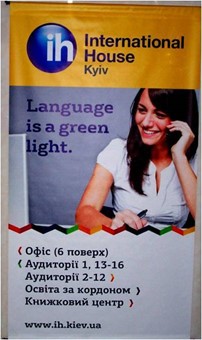
We chose to begin the change with our school website. For us this was a logical first step due to the size of the website and how the website influences our overall marketing campaign on a yearly basis. In addition, approval from IHWO’s advertising agency, In Touch was necessary. After approval by In Touch of the branding materials to our website, a complete overhaul of branding and marketing materials began and continues to the date of this article.
Initial hurdles
The initial problem for IH Kyiv was ‘Rufus’. This font, required for all English language in the branding project, was not initially supported in Ukraine, nor does it come in a cyrillic version. After getting ‘Rufus’ for our needs we then found an appropriate counter-part font for the Cyrillic alphabet. The result is our use of ‘Agora Slab’ which is as close to ‘Rufus’ as we can come and honor the intention of the branding project.
For anyone beginning the rollout, you will need to ensure that whatever L1 language you are working in supports ‘Rufus’ or find an appropriate equivalent. As you can imagine it is very important to get the two scripts as close as possible so that clients do not see a noticeable difference between advertising seen in English and advertising seen in the L1.
Where there is help
In terms of website design some of the work is done for you. If you want there are stock photographs available for some of the sections of your website. For example, we are using stock photographs for Company Classes and Young Learner classes, but use our own for Teacher Training, General English and ESP.
As an advisory point, we would suggest that you create your initial home page and then have it reviewed for brand appropriateness so that you do not create an entire site and then have to change everything. Luckily, our web manager is an employee of the school, but if you intend to use an outside service, having to duplicate work due to unintended errors will, of course, be cost prohibitive.
Paper or Plastic?
Whatever your decision on where to start, two areas will be time consuming and require a certain amount of prioritization in terms of things to do first and things to put off till later. As we all know, paper advertising, and the plastic items that accompany it are what a client takes home with them when they come to the office. Below is a list of some of those items (obviously each school is different):
- Outdoor/indoor signs
- Pricing policy brochures
- Tri-fold advertising at point of sale
- End of Level or course completion certificates
- All your stationery (calendars, letter head, payment cards, payment receipts)
- All your business cards (remember about L1)
- Name tags on teacher lockers
- Door number signs
- Signs indicating Director, Accounting, Teachers’ Room, Study Abroad, Book Centre
- The map of all the IH schools in the world
- Your teacher pictures that students look at in reception
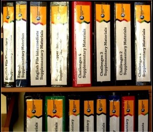
- All your supplementary materials folders for all levels, all books (resources)
- Your school's internal website
- All in-company materials
- Level chart descriptions
- All tests
This non-exhaustive list might look very daunting. The estimated time spent by staff on creating the new material with appropriate design, design approval with In Touch (which truth be told is not bad as they are good organization to work with), ordering new printed stationary is not as extensive at it would initially seem. Once your design is approved, you can begin working with templates to save time.

What is not yet on this list, but should be at some point, is the IHWO requirement of posting in a visible area the IH Charters; as well as the Code of Conduct and Affiliation Certificate.
In general, decisions must be made about which items need to be done quickly and which can wait. A lot, I believe, depends on your commitment to the overall goal of the new branding policy and whether you embrace the opportunities that I outline below.
What do your teachers need?
One thing that we are working toward is having templates on all computers in the school. The initial proposal is to have both a file and an icon on the desktop. Here education at staff meetings is of paramount importance. A decision must be made about what should and should not be provided with a branding seal on any piece of work created by a teacher.
Our approach is evolving. Currently, if a teacher creates a document for a class on their own we politely request that it be branded with one of the appropriate templates available on the computers. When a teacher uses photocopiable materials from a resource pack those which already contain a copyright at the bottom indicating “photocopiable”, we are not “branded”.
An important aspect in implementing this program from a teaching standpoint is creating a system where teachers are able to quickly access the templates and that they are easy to use. Because teacher preparation time can be time-consuming, efficient processes can ease the teachers’ work load and add to the overall product for a school.
A secondary, though no less important concern, is teacher education. In our initial presentation of the branding project for this academic year I used the Coca-Cola analogy. Coca-Cola should taste the same in Kyiv as it does in Tallahassee, Florida. However, we are not saying all schools have the same education processes and administrative processes. One of the unique aspects of the network is the ability to create systems that are unique to the countries where we teach. What I believe is important in this first step is that teachers are aware that we are building brand awareness through placing ‘branding’ on materials in order to spread ‘the word’ with both current and potential students.
What is unknown at this point is how long it will take experienced teachers to adopt the branding requirement to self-created materials. For teachers, much of what happens in the branding project is invisible to them. We are asking that they participate by branding their materials in accordance with new procedures, nothing more.
Benefits to us all
Initially there was some skepticism to this new branding plan from our office. Over the last several months, since none of the teachers had to do much, the brand has become accepted office-wide. In general, most initial comments are favorable now that it can be seen in its totality. Many clients notice the colors as well the new organization of the marketing materials. Because it is a definite change from the previous emblem, brand awareness is already building.
We have seen immediate benefits. One of these is the feeling of ‘reboot’. With these new vibrant colors and changing materials in every area of the school there is a feeling similar to remodeling your home. Everything that used to say IH on it, now says IH in a new way, catching the attention of just about everyone. The clean lines and the use of white with the rainbow of colors makes you want to apply to be on a show for Fine Living Network.
This sense of change has brought about discussion by staff and teachers about the brand itself and what it means. This has spurred some employees to actually go and read the Branding Handbook which was distributed earlier in 2011. This type of staff/teacher interaction is an excellent form of team building without people actually attending a team building session.
Further, by going back and reading the ‘handbook’ teachers and staff suddenly discover ‘the Brand Onion’. ‘The onion’ is a unique layered graphic that uses a series of one word categories representing the IH core values and could represent how employees view their workplace and their experience with IH.
Down-the-road benefits
Each department, it is hoped, can experience future benefits from this project. For teachers this new branding policy has many long term benefits. For those seeking continuity from school to school within the network during the yearly transfer period, implementation of this approach to IHWO will create consistent policy that will be followed throughout the network.
In Study Abroad departments the down range benefits of this brand awareness can be seen in a more psychological way for our clients. If we can send a client to another IH school which has the same branding, client confidence is raised and client comfort level with the product is increased.
The added benefit for Directors needs to be noted as well. By creating the ‘onion’ as a policy within our brand, teachers should feel a certain safety which then should create longer retention within schools. This longer retention creates a stable brand for each individual school and correspondingly, brand awareness among potential customers and thus brand loyalty.
This same ‘onion’, along with our Staff Charter, should create the same effect with respect to staff, and since front office personnel are often a client’s first impression, the added confidence for staff will do the same for customer brand awareness and brand loyalty.
Are there downsides?
For many schools within the network there is an intuitive feeling that something should be done to create systems whereby employees/teachers/Directors feel that IHWO does something for us. By creating this new project, the organization itself is taking a sweeping turn toward employee confidence in the organization and in the employee’s individual school. However, in all things there are issues that need to be considered.
We are an organization of some 150 schools in 50 odd countries. We have schools that do little to no branding as it stands now. We have many schools that only have IH as part of the process but not part of the marketing. We have schools that may not have the financial resources to go ‘the whole hog’ on branding. All of these things need to be considered with respect to how we approach a full blown transition to this new brand and its associated ‘onion’.
For us as teachers/middle managers, the conundrum is that it is not our decision. Hopefully these issues can be worked out through Director and Trustee meetings that will give all schools the comfort level they need to make the decision that this is ‘the way forward’.
Conclusion
I would be remiss in not mentioning the hard work completed by IH Kyiv’s various staff members and departments in the implementation of this project. Specifically, Sergiy Kozak of our Study Abroad Department has been instrumental in website management, liaise with In Touch and resolving various font related issues. His experience in implementation is invaluable and utilizing him as a resource would be a smart decision for any IH school. In addition, the client management staff of IH Kyiv, led by Sasha Kantor, has managed to create massive change throughout the entire system.
This article has endeavoured to give an introduction to those schools that have not begun the new branding process to see what the options, obstacles and opportunities are when rolling out this project. In addition, I hope that the benefits outlined above shed some light on where IH Kyiv is in this process and the things that we feel are most beneficial for our organization as a whole, as well as questions that must be answered by our leaders.
We would also like to take this opportunity to offer ourselves as a sounding board for questions regarding our process of implementation and how the project benefits us, and possibly you.